
Color Names Are Not Strategy
3 Patti Pearl versus 3 Patti Blue sounds like a fashion contest if you only hear the color words. Marketing likes memorable colors because they stick in group chats. Real differences live in menus, performance on your Android handset, reward cadence you can verify in-app, login reliability, and whether you can find help when something breaks. Treat Pearl and Blue as product experiences, not as personality types.
Players sometimes invent stories: Blue feels calmer, Pearl feels richer, one color “pays better.” Those stories are emotional shortcuts. Hand rankings and variance do not change because an icon leans blue or pearl-white. If a tip seller uses color psychology to push a paid “system,” leave the chat.
Neutral Menu Tourism Test
A clean way to compare Pearl and Blue is a timed menu tour. On each app, find the table list, bonus or rewards area, profile or account section, settings, and support or help entry. Keep a five-minute timer. Write which tour felt less confusing on your screen size. This test beats slogan battles because it measures your navigation speed, not a stranger’s affiliate pitch.
- Run the tour on Wi‑Fi first with a charged phone
- Repeat table entry once on mobile data at your usual play hour
- Screenshot menus for your private notes only — hide IDs and numbers
- Score label readability on your exact model
- Stop the test if either APK source feels unsafe
If you only keep Pearl, the same tourism still helps during week one. Mapping menus early prevents bonus panic later when a button moves after an update. Blue comparison matters when you are genuinely undecided, not when you are collecting color brands like stickers.
Performance on Local Android Devices
Pakistan’s Android mix includes light phones that run warm under long sessions. Compare Pearl and Blue on heat, stutter in the lobby, and recovery after an incoming call interrupts the app. Fancy particle effects can look premium and still hurt frame pacing on older Chipsets. A simpler lobby that stays responsive often wins the daily-driver contest.
Storage pressure matters too. If both APKs are large, keeping both permanently is a silent performance tax. Use dual install only for a short evaluation window. After you choose, remove the spare build and clear leftover APK files from Downloads.
| Observation | What to note | Why it matters |
|---|---|---|
| Cold start time | Seconds from icon to usable lobby | Evening patience is limited |
| Heat after 20 minutes | Warm, hot, or throttled | Affects focus and battery |
| Menu clarity | Labels and icon meaning | Beginner error rate |
| Support entry | How fast you reach help | Recovery speed |
Keep Network Variables Equal
Do not crown Blue the winner after testing it on home Wi‑Fi and Pearl on a congested outdoor 4G cell. Flip the networks and retest. Many “app is broken” feelings are cell-edge feelings. Fairness is boring on purpose.
Learning Support and Beginner Week
Pearl’s structural edge on this website is a full English trail: download, install, login, rules, bonuses, errors, and review. Blue may be perfectly playable, yet if you cannot find matching troubleshooting for your exact failure, you will invent risky fixes. Beginners should weight “time to a safe recovery path” nearly as high as “pretty lobby.”
Advanced players who never read help pages will weight social tables and habit higher. That is valid for them. This comparison still flags the learning-support gap because many readers here are mid-setup, not mid-mastery.
- Prefer the app whose settings you can find without guesswork
- Prefer the app that keeps login recovery obvious
- Prefer clear bonus counters over mystery badges
- Prefer stable sessions over louder launch animations
Rewards Comparison Without Hype
Daily bonuses, referrals, VIP-style progress, spins, and event banners appear across the category. Exact names and timers differ by build. Compare reward clarity: can you tell what you claimed, what is still locked, and what requires an extra action? Vague sparkles are not a benefit. Readable counters are.
Never compare apps using a stranger’s edited win montage. Montages omit losing hours and rarely disclose stake size. Your own one-week notes on claim success and session stress are better evidence than a viral clip titled with a color name.
If either brand is promoted with hack APKs, unlimited balances, or guaranteed cash claims, treat that promotion as a reason to walk away from the promoter — not as a reason to trust the color.
Source Hygiene for Both Brands
Sideload reality means Pearl and Blue can both be damaged by careless APK hopping. Signature mismatches, cloned packages, and “mod menus” destroy comparison validity. Decide that unsafe sources disqualify a candidate immediately. A beautiful Blue build from a hostile link is not a candidate. A Pearl file wrapped in survey malware is not a candidate either.
After install, review permission prompts. Gameplay does not require handing your phone to remote helpers. Any Blue-versus-Pearl debate that ends with “install this helper tool” has left product comparison and entered account-risk territory.
Who Should Lean Pearl or Blue
Lean Pearl if you want connected English setup pages, a structured beginner week, and troubleshooting that matches the rest of this site. Lean Blue if your trusted circle already uses it cleanly, your device runs it smoothly in your own tests, and you are not relying on rumor packs. Lean neither if your real goal is guaranteed profit — that goal does not belong in this category.
- Write your top three must-haves before opening either app
- Eliminate any candidate that needs a modded APK story
- Keep the winner as primary for thirty days
- Re-run menu tourism after the first major update
- Measure success by calm sessions, not by highlight screenshots
Pearl versus Blue should end in a quieter phone: one primary app, clear login ownership, and fewer download folders. Color rivalry is entertainment for comment sections. Your storage space, OTP safety, and sleep schedule are the real scoreboard. Choose the build that respects those constraints, then practice rankings and pacing instead of collecting alternate icons.
Closing Comparison Note
If scores remain close, pick the app that makes responsible limits easier to keep. The “best” color is the one that does not push you into chase sessions at 2 a.m. That standard sounds unglamorous because it is adult. It is also the only standard that still matters after the novelty of a new icon fades.
Beginner-Week Friction Comparison
Week one friction is a sharper lens than color branding. Count how many times you hesitate before finding settings, how often you mis-tap a bonus counter, and how long it takes to reach a support entry. Do this on Pearl and Blue with the same phone brightness and font size settings if your Android skin allows. The app that reduces hesitation usually reduces mistaken stakes too.
Friction also includes emotional noise. Some lobbies flash more event chrome. That chrome can be fun and still raise pulse rate for new players. If your goal is learning rankings, quieter visual load can be an advantage even when a friend insists louder equals better. Note whether you rushed because the UI shouted.
Another beginner friction point is vocabulary mismatch between cousin slang and button labels. If Blue’s labels match your friend group’s slang better, that is a real social UX win. If Pearl’s labels match the English pages you are reading on this site better, that is a documentation UX win. Score both; do not pretend they are the same.
Update Anxiety Side by Side
Sideload updates create anxiety for both Pearl and Blue. Compare how you feel when a banner demands an update: do you know a careful path, or do you scramble through random chat files? Pearl’s surrounding update and changelog-style pages exist to lower that scramble. Blue may still feel fine if your circle already maintains a clean shared file habit. Anxiety is measurable when you write it down.
After an update, remapping menus should take minutes, not an evening of reinstalls. If either app trains you into reinstall addiction, the problem may be process, not color. Adopt one update ritual and apply it to whichever brand you keep. Rituals travel; panic does not have to.
- Note version before updating either app
- Update only from your chosen careful path
- Run the same five checks after each update
- Refuse helper tools offered in comment sections
- Uninstall the non-primary brand after the test window
Long-Horizon Choice Beyond Color
Think three months ahead. Will you still remember why you picked Blue’s icon energy, or will you care that login recovery remained obvious? Long-horizon players usually value recoverable accounts, stable sources, and friend agreements more than launch-day aesthetics. Pearl tends to score well when documentation and recovery matter; Blue can score well when the social graph and device tests already align.
End the comparison by deleting leftover APKs for the rejected brand and clearing screenshots that contain identifiers. A finished comparison leaves the phone lighter. If your Downloads folder still holds five color-named clones, the comparison is not finished — it is postponed clutter. Choose, clean, and practice rankings with the survivor.
Finally, refuse to reopen the Pearl versus Blue debate every time a new event banner appears. Events rotate on purpose. Your primary-app freeze protects attention. Revisit only after a device change, a broken source, or a calm monthly review — not after a single frustrating hand that happened on bad signal.
Readability on Smaller Screens
Many budget phones in Pakistan ship with smaller displays and aggressive default font scaling. Compare Pearl and Blue for tap-target comfort and whether critical labels wrap into confusing fragments. If you wear glasses or play in bright outdoor light, readability outranks pastel branding quickly. A color name cannot compensate for buttons you mis-hit.
Try one session at 50 percent brightness and one at full brightness. Note glare and contrast. These notes sound minor until you fold the wrong hand because a confirmation label was hard to see. Include readability in your final rubric beside performance and social fit.
Screenshots
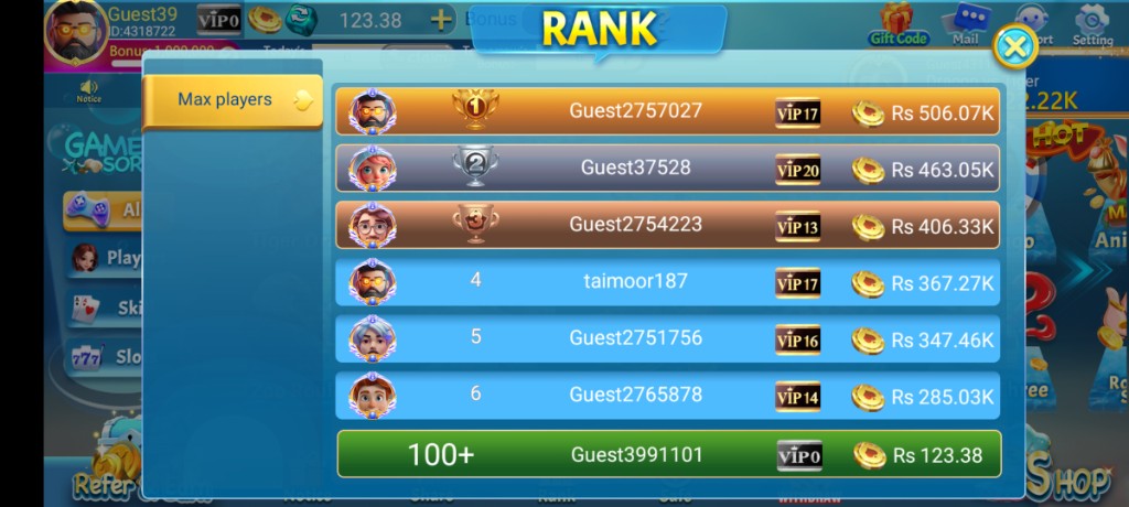
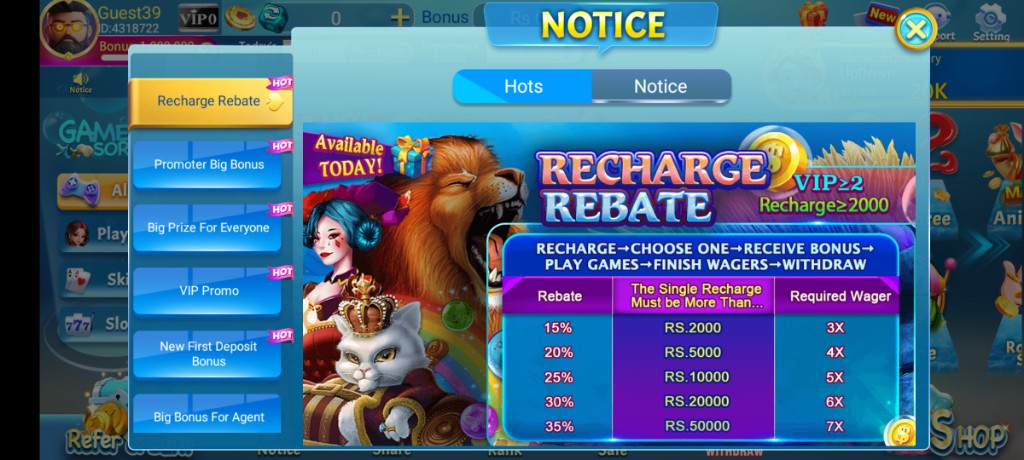
These are real app UI screenshots to make each step easier to follow. Balances and events can change, so always match what you see in your installed version.
Frequently Asked Questions
Is this comparison biased?
It is Pearl-first because this site teaches Pearl, but it stays non-defamatory and practical.
What if Blue feels lighter on my phone?
Performance fit can beat brand loyalty. Choose stability.
Should I install both forever?
Keeping unused APKs increases clutter and risk surface. Keep what you use.
Do UI themes decide the winner?
Theme is personal. Reliability and clear payments matter more for many Pakistan users.
Where do I go after choosing Pearl?
Start with the APK download and beginner pages.
Are feature lists identical?
No. Always verify inside your installed build.
Conclusion
When you finish comparing, the Pakistan apps shortlist page helps you decide.
Next step: Best Teen Patti Apps in Pakistan Including 3 Patti Pearl.